
Did you know that over 70% of online shopping carts are left behind before a purchase is made? This is a common challenge for every store owner. Seeing items added but never bought can be frustrating.
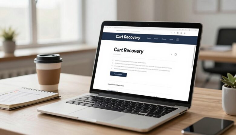
An abandoned cart email is an automated message sent when a visitor adds products to their cart but doesn’t complete the checkout. Its job is simple: to re-engage those shoppers. It reminds them about the items they liked and encourages them to finish their transaction.
Setting up a series of these messages isn’t just a nice extra. It’s a critical revenue recovery tool. Data shows these emails have impressive open and click-through rates. This makes them one of the most effective tactics in your marketing toolbox.
The core idea is to understand why people leave. By systematically addressing their concerns, you turn abandonment into a real opportunity. A well-crafted series feels less like advertising and more like a helpful nudge from a friend.
I’ll show you that even with basic tools, you can build a process that works. We’ll look at timing, message content, and proven ways to boost your conversion rate. Let’s get started.
Key Takeaways
- Over 70% of online shoppers abandon their carts before completing a purchase.
- Automated email reminders are triggered when items are left in the cart at checkout.
- This email series is a powerful strategy for recovering potential lost revenue.
- Success comes from understanding the reasons shoppers hesitate and addressing them.
- These messages typically achieve high engagement rates, making them very effective.
- Any brand, regardless of size, can implement a successful recovery process.
- A good sequence feels helpful and personal to the customer, not pushy.
Why Recovering Abandoned Carts is a Game-Changer for Sales
For most online stores, the biggest opportunity for growth isn’t in finding new visitors, but in re-engaging the ones who were ready to buy. These shoppers have already shown strong intent. They’ve browsed your products and clicked ‘add to cart’.
Your job is to gently guide them back to complete the transaction. Doing this well doesn’t just save a sale. It can fundamentally transform your revenue stream.
The Shocking Reality of Cart Abandonment Rates
The numbers are hard to ignore. A meta-analysis by the Baymard Institute shows the average online cart abandonment rate is a staggering 70%. This isn’t a tiny leak. It’s a massive hole in the sales funnel.
Think about what this means. For every ten people who put items in their basket, seven leave without finishing. Each one represents a high-intent visitor who was moments away from a purchase.
They are one of your most valuable audiences. Ignoring them means walking away from a huge pile of potential revenue.
How a Recovery Sequence Directly Boosts Your Revenue
This is where a strategic email series becomes your secret weapon. Research from Moosend reveals the powerful performance of these messages. They achieve an average open rate of 43% and a click-through rate of 21%.
Even better, half of the people who click end up buying. A single, well-timed reminder can convert about 10% of recipients. You’re not chasing cold leads. You’re reminding warm, interested shoppers.
Sending more than one message dramatically increases your success. Expert Chase Dimond notes that a multi-email process results in 69% more orders than just sending one.
This approach directly recaptures sales that would otherwise be lost. It’s like printing money from the traffic you already have.
Beyond the immediate sale, recovering a checkout can start a real relationship. You turn a one-time browser into a loyal customer. Investing in this process offers one of the highest returns in marketing.
It’s a non-negotiable for any serious e-commerce brand.
Understanding Why Shoppers Abandon Their Carts
A significant portion of online shoppers leave items behind not because they lose interest, but due to specific friction points in the buying journey. According to research from the Baymard Institute, about 43% of people who don’t complete a purchase were “just browsing.”
That leaves a majority of shoppers who intended to buy but encountered a deal-breaking obstacle. Your mission is to identify and fix these issues. Let’s break down the most common reasons.
High Shipping Costs and Unexpected Fees
This is the top financial barrier. Baymard found that 39% of shoppers who leave do so because extra costs are too high. The problem isn’t always the price itself, but the surprise.
When shipping costs or taxes appear only at the final checkout step, it feels like a bait-and-switch. This erodes trust instantly. Customers have already decided on a total in their mind.
Transparency is your best tool here. Display all fees early, or consider offering a minimum spend for free shipping. It removes a major point of hesitation.
Slow Delivery Estimates
In the age of two-day shipping, patience is short. If your delivery window is a week or more, you risk losing the immediate desire to own the item. Slow estimates can push shoppers to search for faster alternatives.
This is especially true for impulse buys. The longer the wait, the more time a person has to second-guess their decision. Clearly communicating your processing times and partnering with reliable carriers can help manage expectations.
Concerns Over Website Security and Trust
Handing over credit card details online requires faith. With reports of credit card fraud rising by 65% between 2019 and 2024, this concern is very real. If your website lacks clear security signals, hesitation is natural.
Visible trust badges like SSL certificates, Norton Secured, or McAfee seals are crucial. A professional design and easy-to-find contact information also build confidence. Your goal is to make the checkout feel like a safe place.
Restrictive or Unclear Returns Policies
Shoppers want a safety net. With about 30% of online products being returned, a strict or confusing policy is a major red flag. If people feel uncertain about their ability to send an item back, they often won’t buy it in the first place.
Highlight a fair, clear returns policy on product pages and during checkout. Terms like “free returns within 30 days” directly address this anxiety and can boost conversion confidence for your brand.
Limited Payment Options
This is a straightforward roadblock. Not offering a buyer’s preferred payment method is an easy reason to leave. Some people prefer PayPal for its speed and security. Others use Apple Pay or Google Pay for convenience.
Even buy-now-pay-later services like Klarna or Afterpay can be decisive. Each missing option is a segment of customers you’re turning away. Review your payment gateway to ensure you’re covering the major bases.
Other reasons include simple distractions, comparison shopping, or just changing one’s mind. While you can’t control everything, understanding these core reasons gives you power.
This diagnosis is the essential first step. It allows you to craft communication that directly addresses your customers’ specific pain points. You can then build a process that feels helpful, not pushy.
The Anatomy of a High-Converting Abandoned Cart Email
The difference between an email that gets ignored and one that drives a shopper back to buy lies in its core components. I’ll break down each essential piece you need. Let’s build a message that works.
Attention-Grabbing Subject Lines
Your subject line is the gatekeeper. It decides if your email gets opened or deleted. Personalization is your best tool here.
Mentioning the product name or the customer’s first name creates instant relevance. For example, “Alex, your hiking backpack is waiting!” is far more effective than a generic “You forgot something.”
Other powerful approaches include hinting at an offer (“A little gift for you inside”) or sparking curiosity (“Did you have a question about these?”). Test different styles to see what resonates with your customers.
Detailed Product Information and Images
Once the email is open, the visual reminder takes over. Always include a high-quality image of the left-behind item.
This acts as a powerful memory trigger. Pair the image with key details: price, color, size, and a short description.
Seeing the exact item they wanted makes the purchase decision feel familiar and easy. It removes the need to go back and search your website.
Personalized Messaging Beyond the Name
Advanced personalization moves past “Hi [Name].” Use your customer data to add hyper-relevance.
Reference their shopping history. “Since you loved our last candle, we thought you’d like this one too.” You can also note their cart value. “You’re just $10 away from free shipping!”
This shows you see them as an individual. It builds a connection that generic marketing blasts cannot.
Clear and Compelling Calls to Action
The call-to-action (CTA) button is the bridge back to the sale. Its job is singular: guide the click.
Use action-oriented language like “Complete My Order” or “Claim My Items.” Make the button a distinct, bold color that stands out against the email background.
Ensure it’s large enough and easy to tap on mobile. A confused customer won’t convert. Your CTA must leave zero doubt about the next step.
Strategic Incentives like Discounts or Free Shipping
Sometimes a small nudge is needed. Incentives can tip the balance for hesitant shoppers. The key is to use them strategically.
Offering free shipping for orders over a certain amount can increase your average order value. A limited-time discount code can create urgency.
Be careful not to train customers to always wait for a deal. Reserve incentives for your later follow-up emails or for high-value carts.
| Incentive Type | Best Use Case | Potential Impact |
|---|---|---|
| Percentage Discount | High-value items or final reminder messages. | Directly reduces price barrier; can boost conversion rate. |
| Free Shipping | Carts just below your shipping threshold. | Encourages adding another item; addresses top checkout concern. |
| Bonus Gift | To enhance perceived value without discounting. | Builds goodwill and can differentiate your brand. |
Social Proof from Reviews and Testimonials
Last-minute doubts are common. Social proof acts as reassurance from fellow buyers.
Include a short, positive customer review or star rating for the product in your email. This proof validates the shopper’s choice.
It answers the silent question, “Are others happy with this?” This external validation is a powerful trust signal for your brand.
Urgency and Scarcity Elements
These psychological triggers encourage immediate action. They counter the “I’ll buy it later” mindset.
Urgency is about time. “Offer expires in 24 hours!” Scarcity is about availability. “Only 3 left in stock!”
Use these elements honestly and sparingly. When real, they create a fear of missing out that can drive a purchase now.
Combining all these components creates a cohesive and persuasive message. Each part supports the other, guiding the customer smoothly from inbox back to checkout.
Step 1: Analyze Your Cart Abandonment Data
Building an effective re-engagement process starts with a deep dive into your own store’s data. Generic fixes won’t cut it. You need to know why your specific visitors are leaving items behind.
This analysis moves you from guesswork to evidence. It ensures your follow-up emails target real problems, not imagined ones. I treat this phase as a source of invaluable customer feedback.
Let’s explore three powerful ways to gather these insights.
Using Heatmap Tools to Identify Checkout Drop-Offs
Tools like Hotjar provide a visual map of user activity on your website. Heatmaps show where people click, scroll, and hesitate. Session recordings let you watch real visitor journeys.
This research reveals UX issues numbers alone can’t. You might see shoppers repeatedly clicking a non-responsive button. Or they may abandon the checkout when a shipping calculator loads.
For example, a common finding is a too-long form causing friction. Identifying these exact drop-off points is the first step to a fix.
Surveying Customers to Uncover Pain Points
Sometimes, you just need to ask. Implementing a short survey within your exit flow provides direct qualitative proof.
Ask a simple question like, “What almost stopped you from buying today?” This direct feedback uncovers reasons like unexpected costs or trust concerns.
This method gives voice to your customers’ hesitations. It complements the quantitative data from heatmaps perfectly.
Controlled A/B testing on your checkout page is another key tactic. Change one variable at a time, like the button color or form length.
Measure the impact on your conversion rate. This isolates what truly works for your audience.
| Analysis Method | What It Reveals | Best For Diagnosing |
|---|---|---|
| Heatmaps & Recordings | Visual user behavior and interaction patterns on key pages. | Technical UX flaws, confusing navigation, and interface problems. |
| Post-Abandonment Surveys | Direct customer motivations, fears, and price sensitivities. | Psychological barriers, value perceptions, and policy concerns. |
| A/B Testing | Clear cause-and-effect data on specific page changes. | Optimizing button placement, copy, and form fields for higher success. |
Common findings include unexpected cost calculations or confusing navigation. Adopt a mindset of curiosity. See each lost cart as a learning opportunity.
A data-informed foundation makes every subsequent step more effective. You’ll know which message timing and marketing angles will resonate.
You can then craft emails that feel helpful and personal. This builds a stronger brand connection and drives more completed purchases.
Step 2: Design Your Multi-Email Abandoned Cart Recovery Sequence
A well-designed email series acts like a roadmap, leading potential buyers from hesitation to purchase. I recommend a classic three-message structure for most stores. This framework balances gentle reminders with strategic nudges.
The psychology is straightforward. Your first email capitalizes on immediate interest. The second builds value and trust. The third creates a final sense of urgency. Getting the timing right for each stage is crucial for success.
Let’s break down each stage of this powerful cart recovery sequence. I’ll share the goal, optimal send time, and core strategy for every one of your emails.
Email 1: The Gentle Reminder (Send 2-4 Hours After Abandonment)
This initial message is your lightest touch. Send it 2 to 4 hours after items are left behind. This timing is ideal. It’s not so immediate that it feels invasive, but it’s soon enough to catch the shopper while your products are still fresh in their mind.
The goal is simple: a visual nudge. Use a clear image of the left-behind item and a direct call-to-action like “Complete My Order.” This leverages loss aversion—the idea that people hate to lose something they’ve already chosen.
Keep the copy friendly and concise. Avoid adding extras like discounts here. This first email should feel like a helpful reminder, not a sales pitch. It sets the tone for your entire cart recovery effort.
Email 2: The Value-Added Follow-Up (Send 24 Hours Later)
Your second message arrives about a day later. By now, initial intent may have faded. This email needs to reignite interest by adding new value and addressing doubts.
Incorporate elements like customer reviews, star ratings, or a strong guarantee. This proof reassures shoppers that others love the item. You can also highlight different product benefits or usage scenarios.
For example, if someone left a skincare set, detail its key ingredients. This follow-up isn’t just another reminder. It provides the social validation and deeper information needed to tip the scale toward a purchase.
Email 3: The Last-Chance Offer (Send 3-5 Days Later)
This is your final attempt. Send it 3 to 5 days after the initial event. The strategy here shifts to creating urgency with a strategic incentive.
A limited-time discount or a free shipping offer can be that final nudge. Frame it as a “last chance” to claim the items. This message directly targets the “I’ll buy it later” mindset.
Use this tactic carefully. You don’t want to train your customers to always wait for a deal. Reserve it for high-value carts or as a final conversion tool. When used sparingly, it effectively clears hesitation.
Brands like Dollar Shave Club and Winc use variations of this multi-email approach with great success. Their emails feel personal and build their brand voice while driving customers back to their website.
Remember, this three-email structure is a framework. Test the timing and content of each stage. See what resonates best with your audience. Avoid sending emails too close together. Also, don’t extend the series beyond three messages for most cases to prevent annoyance.
This process turns a simple reminder into a cohesive marketing campaign. Each email has a distinct role in guiding the buyer back to checkout. With the right timing and message, you’ll see a strong boost in your conversion rate.
Step 3: Personalize Your Sequence for Maximum Impact
Imagine receiving an email that knows exactly what you left behind and why you might hesitate—that’s the goal of personalization. Generic blasts get deleted. Tailored messages get opened and clicked.
This step is about using the data you already have. You’ll make each communication feel like a one-on-one conversation. It builds a stronger brand connection and drives more completed purchases.
I advocate for moving beyond basic templates. Let’s explore how to leverage your customer information for dynamic content and smart segmentation.
Leveraging Customer Data for Dynamic Content
A capable marketing platform is your best friend here. Tools like Klaviyo allow you to insert specific details automatically. These details include product names, images, prices, and even personalized recommendations.
This dynamic content transforms a static template. For example, if someone browsed a red dress but didn’t buy, your email can show that exact item. You can also reference their shopping history or loyalty points.
The proof is in the performance. Research shows personalized emails deliver six times higher transaction rates. They make the recipient feel seen as an individual, not just a contact on a list.
Start by ensuring your platform connects with your store’s data. Key data points include:
- Cart contents and total value
- Browse history and viewed products
- Past purchase behavior and frequency
- Customer support interaction history
Use this data to populate fields in your email automatically. This level of detail requires a capable system but is achievable for many businesses.
Segmenting Based on Cart Value and Purchase History
Not all carts are created equal. Strategic segmentation ensures your message and offers are contextually appropriate. This is one of the most powerful ways to boost your conversion rate.
Create different paths for different customer groups. For instance, treat a high-value cart differently from a low-value one. You might offer a strategic incentive only for the high-value group to protect your margins.
Also, segment based on purchase history. A first-time visitor needs more trust signals. A repeat customer might appreciate a loyalty reward or a reminder about their favorite brand.
Exclusion is just as important. Always exclude customers with open support tickets. Sending a “complete your order” nudge while they have a problem is poor timing and hurts trust.
Look at brands like Beardbrand for inspiration. They use highly personalized copy and product-focused CTAs. Their emails feel like a helpful note from a friend who remembers your style.
Here’s a simple segmentation framework to start with:
- High-Value Carts (e.g., over $100): Consider adding a small incentive or free shipping to secure the sale.
- First-Time Shoppers: Focus on building trust with reviews, guarantees, and clear return policies.
- Repeat Customers: Acknowledge their loyalty and remind them of their past positive experiences.
- Excluded Segments: Those with recent support inquiries or who have already purchased the item.
This approach shows customers you understand their specific situation. It’s not just about a higher conversion; it’s about building long-term loyalty.
Begin with one simple segment, like cart value. Then, gradually add more layers as you grow. Personalization turns a standard sequence into a powerful marketing asset that respects your customers’ time and interest.
In a crowded inbox, your subject line is the single most important factor determining whether your email gets opened or ignored. This is Step 4 in building your process. I treat it as the gatekeeper to your entire message.
If the subject doesn’t grab interest, your beautifully crafted content never gets seen. You must craft lines that stand out and feel personal. This step is about psychology and brand voice.
Step 4: Craft Subject Lines That Stand Out in the Inbox
Your subject line is a promise. It tells the recipient what’s inside and why they should care. In the context of a forgotten cart, it needs to be relevant and compelling fast.
I always start with personalization. Then, I experiment with tone. Let’s break down these two powerful ways to win the inbox.
Incorporating Personalization Tokens for Relevance
Basic personalization uses tokens like the customer’s first name or the product name. Inserting these details boosts open rate instantly. It makes the email feel like a one-on-one note.
For example, “John, your new sneakers are waiting!” is far more effective than “Complete your purchase.” Advanced platforms can even reference the cart value or last browsed item.
This isn’t just a trick. Research shows personalized subject lines generate higher engagement. They signal that the message is specific to the recipient’s recent activity on your website.
Testing Different Approaches: Humor vs. Directness
Tone is where your brand personality shines. A direct, benefit-focused line works for many. “Your items are reserved for 24 hours” creates clear urgency.
Other brands use humor or clever copy. The beverage company Liquid Death uses dark humor aligned with its identity. What works for them wouldn’t suit a luxury jeweler.
The best approach depends on your audience’s expectations. You must test to learn what resonates. A/B testing different subject line strategies is a non-negotiable practice.
I rely on data, not guesses. Try one version that’s direct and another that’s playful. See which drives more opens and clicks over time.
Here are a few of my favorite subject line formulas you can adapt:
- “We saved your [Product Name]!”
- “Complete your order for free shipping.”
- “Your cart is getting lonely 😢”
- “Last chance for the items you picked.”
These templates provide a starting point. Always customize them for your customers and products.
Avoid spammy or misleading lines. Phrases like “Act now!!!” or “Urgent notice” can damage trust. They often increase unsubscribe rate.
Your subject line should be an honest preview of the email’s value. It must be compelling enough to interrupt a busy shopper’s day.
Great subject lines turn a routine reminder into a welcomed message. They are the first critical touch in guiding someone back to checkout. Master this, and you’ll see a direct boost in your conversion success.
Step 5: Write Email Copy That Reflects Your Brand Voice
Effective email copy feels like a conversation with a friend, not a transaction with a store. This step is where your brand personality comes alive. The words you choose can build trust and guide shoppers back to complete their purchase.
I see too many emails that sound robotic. Your goal is a conversion, but your tone should be human. Let’s explore ways to make your message concise, friendly, and action-oriented.
Keeping Copy Concise, Friendly, and Action-Oriented
First, keep your body text short and scannable. People skim their inbox. Use short paragraphs and bullet points if you have several details. This improves readability and respects your customers’ time.
Infuse every line with a helpful, friendly tone. Imagine you’re a store associate reminding someone about an item they liked. Your language should be warm and inviting.
Always use action-oriented words that point toward the next step. Phrases like “Complete your order” or “Claim your items” are clear. They should fit naturally into a conversational flow.
Avoid being so salesy that the email feels pushy. Also, don’t be so friendly that the call-to-action gets lost. Balance is key for success.
Examples of Brand-Aligned Messaging from Top Companies
Great brands weave their core values into every communication. Look at Girlfriend Collective. Their reminder message says: “Looks like you left something cute and sustainable in your cart. Don’t worry, we saved it for you.”
Alex McPeak of Klaviyo praises this example. It hammers home the sustainability aspect central to their brand. This makes the email feel like a thoughtful note, not a pitch.
What makes these examples work? They feel personal. It’s as if a store associate remembered you and your interest. This builds a stronger connection than a generic blast.
I suggest you audit your own brand voice. Identify two or three key adjectives that should describe all communications. Is your brand playful, authoritative, or reassuring? Apply these traits to your email copy.
Use this research and proof to inspire your own marketing. Your website and checkout should share the same voice. Consistency builds trust across every touchpoint.
Remember, your customers receive many emails. A distinct, authentic voice helps you stand out. It turns a functional reminder into a relationship-building touchpoint.
This approach addresses common reasons for hesitation. It makes shoppers feel valued. They are more likely to return to your site and complete their shopping.
Focus on clear images and product details in your emails. Good timing and a strong brand voice work together. They guide people back to the place where they can finish their transaction.
Test different styles to see what boosts your open rate. Your cart reminders will feel more personal. This leads to happier customers and more completed purchases.
Step 6: Showcase Products with High-Quality Images
A stunning product photo can do what paragraphs of text cannot—spark immediate emotional recall. This step is about making your items impossible to ignore. I believe in e-commerce, a picture is worth far more than a thousand words. It’s the direct trigger for desire.
Your visual assets are the hero of your follow-up message. They remind people what they almost owned. Let’s explore how to use imagery to drive action.
The Power of Visual Reminders in Driving Conversions
A high-quality, professional image serves as a powerful visual reminder. It reignites the emotional connection that led to the item being added in the first place. This is crucial for turning interest into a completed purchase.
Think of it as a digital window display. When a shopper sees that exact item they wanted, it feels familiar. The decision to buy becomes easier. This visual nudge directly boosts your conversion rate.

Look at brands like Alex Mill for inspiration. They dedicate most of their email real estate to beautiful product shots. This makes the items highly desirable. Often, they complement this with a strategic discount offer.
The image acts as the primary call to action. It draws the eye and re-sparks interest. Your copy and button then support this visual focus.
Best Practices for Product Photography in Emails
Great visuals don’t happen by accident. Follow these principles to ensure your images look professional and load fast.
First, use clean, well-lit photos on a neutral background. This puts the focus entirely on your product. Show multiple angles or the item in use. Lifestyle shots can help customers imagine owning it.
Technical optimization is just as important. Ensure your files are the right dimensions for email clients. Compress them for fast loading times. Slow emails frustrate recipients and hurt your success.
Always include clear alt-text for each image. This improves accessibility for screen readers. It also helps with deliverability if images are blocked.
What if professional photography isn’t in your budget? Clean, consistent photos from a modern smartphone can work well. Just follow basic composition rules. Use natural light and a simple backdrop.
Here’s a quick reference table for your image strategy:
| Aspect | Best Practice | Goal |
|---|---|---|
| Lighting & Background | Use even, natural light on a white or neutral surface. | Create a clean, professional look that highlights the product. |
| Angles & Usage | Include front, side, and detail shots; show the product in use. | Provide a complete view and help with customer visualization. |
| Technical Specs | Optimize file size (under 1MB); use common dimensions like 600px wide. | Ensure fast email load times and compatibility across devices. |
| Accessibility | Write descriptive alt-text (e.g., “Blue ceramic coffee mug on a wooden table”). | Improve email deliverability and support users with visual impairments. |
| Consistency | Maintain a uniform style across all product images in your emails. | Strengthen brand recognition and create a cohesive shopping experience. |
Investing in great visuals is an investment in higher conversion rates. It addresses a key reason for hesitation—forgetting how much they wanted the item. Your email becomes a compelling visual invitation to return to your website.
Make the product image the star. Let it do the heavy lifting of reminding and enticing. Your customers will appreciate the clear, beautiful presentation. It guides them smoothly back to checkout.
Step 7: Build Trust with Social Proof and Testimonials
Trust is the invisible currency that turns browsing into buying. Nothing builds it faster than social proof. When someone hesitates, the voices of happy customers provide the ultimate reassurance.
I see this as the antidote to last-minute doubt. Your message isn’t alone. It’s supported by a community of real people. This collective proof makes the decision to buy feel safer and more communal.
Data underscores its power. A Klaviyo report notes that customer reviews are often the most trusted factor for a first purchase from a new brand. This isn’t just marketing fluff. It’s a psychological shortcut your shoppers use to reduce risk.
Including Customer Reviews and Star Ratings
Star ratings and short testimonials work beautifully in reminder emails. They offer a quick, visual signal of quality. I recommend featuring them near the product images.
Look at SKIMS for a great example. Their follow-up email displays a clear star rating alongside a positive review snippet. This builds credibility at the critical moment.
Selecting the right testimonials is key. Choose ones that speak to specific benefits. They should overcome common reasons for hesitation, like fit, quality, or value.
Here are the most effective forms of social proof for your emails:
- Star Ratings: A simple 4.5+ score instantly signals satisfaction.
- Short Testimonials: A single sentence praising a key feature.
- Review Snippets: A direct quote about the user experience.
- Case Study Highlights: Brief results from a specific customer.
Sourcing this content is straightforward. Pull from your site’s review section or a platform like Trustpilot. Always ask permission if you use a full name or photo.
Using User-Generated Content to Enhance Authenticity
User-generated content (UGC) takes authenticity to another level. A photo from a real customer using your product is incredibly persuasive. It feels more genuine than a polished studio shot.
This type of proof shows your item in real life. It helps shoppers visualize themselves owning it. UGC builds a stronger brand connection because it comes from peers.
Displaying UGC cleanly is important. You don’t want to clutter your email design. I suggest a simple grid layout or a single standout image.
Pair the photo with a short caption from the user. This combination is powerful. It provides visual and verbal social proof in one glance.
Here are my practical tips for integrating UGC:
- Credit the Source: Always tag the customer’s handle if possible.
- Ensure Quality: Use clear, well-lit photos even if they’re casual.
- Keep it Focused: One or two UGC elements per email is plenty.
- Link to More: Add a subtle link to a gallery of UGC on your website.
This approach transforms your reminder from a solo sales pitch. It becomes a chorus of satisfied customers. That collective voice is what guides hesitant shoppers back to checkout.
In the end, social proof addresses the fundamental question: “Are others happy with this?” When your email answers “yes” with proof, you remove a major barrier. You pave the way for a confident purchase.
Step 8: Offer Incentives That Nudge Without Hurting Margins
The right incentive at the right moment can turn hesitation into a completed transaction. But the wrong one can hurt your business long-term. I see this step as the delicate art of the promotional nudge.
Your goal is to recover sales without conditioning your audience to never pay full price. This requires a surgical approach. You must use data to guide your choices.
Let’s explore how to apply discounts and free shipping wisely. We’ll also look at how to avoid training your customers to wait for deals.
When to Use Discounts vs. Free Shipping
Not all incentives are created equal. Each serves a different psychological purpose. Choosing the right one depends on the shopper’s barrier.
Remember the data: 39% of people leave due to high extra costs. For them, offering free shipping directly addresses their top concern. It removes the surprise fee that often kills a purchase.
A discount, like 10% off, reduces the item’s price. Free shipping covers the delivery costs. Use discounts for high-value items where a price cut feels significant. Use free shipping for carts just below your threshold to increase order value.
Expert Belle Murray advises a smart timing strategy.
Introduce a free shipping offer toward the end of your automation.
This targets engaged subscribers who are on the fence. It provides the final push they need.
Look at brands like Rudy’s for inspiration. They use time-sensitive free shipping offers prominently. This creates urgency without discounting their products.
Segmentation is key here. Reserve discounts for specific customer segments or high-value carts. This protects your profit margins while still driving conversion.
Avoiding the Pitfall of Training Customers to Wait for Deals
The biggest risk with incentives is creating “discount addiction.” Some shoppers may learn to leave items behind intentionally. They wait for a coupon code to arrive in their inbox.
This behavior erodes your brand value and hurts profits over time. I recommend a few ways to prevent it.
First, use one-off offers for new customers only. The brand Golde does this well. They provide a first-order discount to acquire buyers. This doesn’t train their existing audience.
Second, leverage free shipping more often than percentage discounts. It’s perceived as a service benefit, not a price cut. This maintains your product’s value perception.
Third, consider non-monetary incentives. These can provide a powerful nudge without touching your margins.
- Exclusive Access: Offer early entry to a new product launch.
- Bonus Content: Provide a guide or tutorial related to the item.
- Loyalty Points: Award extra points that can be redeemed later.
These alternatives add value to the purchase without discounting it. They make the shopper feel special.
Always view incentives as a strategic tool, not a blunt instrument. Base your decisions on customer data and cart value. A segmented, thoughtful approach recovers revenue and builds loyalty.
Your emails will feel helpful, not desperate. This careful balance is what turns a hesitant browser into a happy buyer.
Step 9: Optimize Calls to Action for Higher Click-Through Rates
Your call-to-action button is the final bridge between interest and a completed transaction. I see it as the moment where all your hard work pays off. A great CTA feels impossible to miss and irresistible to click.
This step focuses on that critical element. It must eliminate any ambiguity about the next step. Your customer should know exactly what happens when they tap.
Let’s dive into the language and design that drives action. I’ll show you how to turn passive readers into active buyers.
Action-Oriented CTA Language That Drives Clicks
The words on your button carry immense psychological weight. They should command action while feeling natural to your brand voice. I always start with clear, benefit-driven phrases.
For most email marketing, standard options work perfectly. Think “Complete Your Purchase” or “Return to Cart.” These are direct and leave no room for confusion.
Softer brands might prefer “Take a Closer Look” or “Continue Your Journey.” This invites exploration without pressure. Cheeky companies can have fun with “Let’s Do This” or “Seal the Deal.”
The key is alignment. Your CTA copy should match the offer and tone of your message. For example, if your email includes a discount, “Get My 10% Off” is more specific than “Buy Now.”
This subtle shift increases click-through rate. It makes the button feel like a direct gateway to the promised benefit.
Here are my favorite categorized phrases for inspiration:
- Direct & Clear: “Complete Purchase,” “Claim Your Offer,” “Finish Checkout”
- Friendly & Inviting: “Continue Shopping,” “See Your Items,” “Resume Your Order”
- Urgent & Playful: “Snag My Stuff,” “Don’t Lose These,” “Grab It Now”
Testing different phrases is one of the fastest ways to boost your conversion. See what resonates with your specific customers.

Design Tips for Visible and Mobile-Friendly CTAs
A powerful phrase needs a button that’s easy to find and tap. Design can make or break your success. I follow a few non-negotiable rules.
First, use a distinct, contrasting color for your CTA button. It should pop against the email background. This visual cue draws the eye instantly.
Second, make the button large enough. On mobile devices, a small target is frustrating to press. Aim for a minimum tap area of 44×44 pixels.
Placement is equally important. Position your primary CTA prominently in the layout. Often, placing it above the fold ensures it’s seen without scrolling.
Consider pairing it with a secondary, less-committal link. Options like “Continue Browsing” or “Save for Later” keep hesitant shoppers engaged. They offer an alternative without losing them entirely.
Mobile optimization is critical. Over half of all shopping and email opens happen on phones. A poorly sized button can kill your conversion rate.
Here’s a quick checklist for CTA design:
- Color: High contrast with background; aligns with brand palette.
- Size: Large, finger-friendly button on all devices.
- Copy: Concise, action-oriented text in a legible font.
- Whitespace: Ample space around the button to avoid accidental taps.
- Link: Directs to a pre-filled checkout page for a seamless shopping experience.
Remember, the CTA’s job is to guide the click. Every design choice should serve that single purpose.
A well-crafted call-to-action is the culmination of all previous steps. It turns the interest and persuasion you’ve built into a definitive, trackable action.
When your language is clear and your design is intuitive, you remove the final barrier. You make it effortless for people to return and finalize their order.
This focus on the final detail completes your cart recovery strategy. It ensures no purchase is left behind due to a confusing or hidden next step.
Conclusion: Turning Abandoned Carts into Loyal Customers
Every incomplete transaction holds the potential to become a meaningful brand interaction. I reframe this process not as a salvage operation, but as a prime chance to impress shoppers and earn their loyalty.
By analyzing data and designing a personalized email series, you address specific customer concerns. Using social proof and smart incentives then guides them back to checkout.
This approach builds long-term loyalty. A thoughtful follow-up can leave a more positive impression than an uneventful first purchase.
Consistency and a customer-centric mindset transform one-time conversions into repeat buyers. View your email marketing as a living part of your strategy. Test and optimize it regularly.
Consider adding channels like SMS for high-intent flows. This creates a unified shopping experience. Using integrated platforms can streamline recovery and improve your success rate.
Every dropped item is a conversation waiting to happen. With the right approach, you start a relationship that lasts far beyond a single purchase. I’m confident this strengthens your brand and deepens customer connections.
FAQ
Why do shoppers leave items in their online basket without buying?
When should I send my first reminder email?
Are discounts or free shipping better for getting a sale?
How can I make my emails feel more personal?
What’s the best way to build trust in a recovery email?
How many emails should be in my sequence?

Dr. Silas Thorne is a data scientist and SEO architect with over 15 years of experience in algorithmic analysis. Specializing in search intent modeling and technical optimization, he founded freetded.com to bridge the gap between complex big data and actionable marketing strategies. When he isn’t auditing backlink profiles, Dr. Thorne contributes to global digital forensics research.